Retail Digital Signage Content: What Goes Where, and Who Keeps It True
Most store screens fail because the playlist was never given jobs. Match each screen to what the shopper is doing there, and name an owner per message.
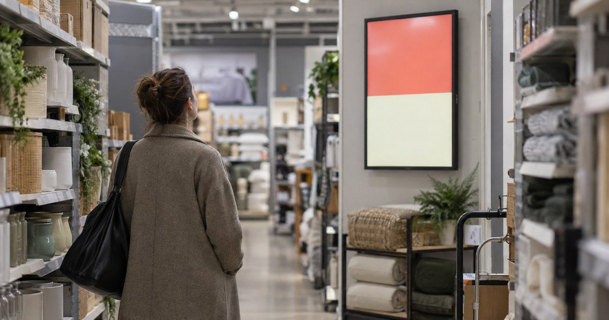
An assumed scenario, constructed to show the decision. It describes no named customer and reports no measured result.
Most store screens fail for a boring reason. Somebody built a playlist once, it looked good in the launch photograph, and eighteen months later it is still cycling the same four messages — including a promotion that ended last spring.
The screens are not the problem. The playlist was never given jobs. This guide is how to decide what each screen in a store should say, based on what a shopper is doing when they look at it, and how to make sure somebody owns each message after launch.
Give every screen one job
Walk the store the way a customer does, and at each screen ask a single question: what is the person standing here trying to do?
If the answer is "walk past," the screen is decoration. If the answer is "work out where the coffee is," the screen has a job. If the answer is "decide between two of these," the screen has a different job.
Then check the screen is adding something. A screen that repeats what is already printed on the packaging, or already written on the shelf edge, is using electricity to duplicate a label. The useful test is simple: does this screen answer a question a customer actually asks staff, or show something the shelf cannot?
Three rules follow from walking the store.
Do not put a brand film where a question is being asked. A brand film belongs where somebody is browsing with time to spare. In front of a product comparison it competes with the decision the customer came to make.
Do not stack promotions. One offer per screen is easier to test than four, because a shopper walking past will read the largest element and move on. If you need four offers, four screens in four places will tell you more than one screen carrying all four.
Decide what the viewer should know or do before you pick the creative. Creative chosen first will bend the job to fit the artwork.
Match the message to the zone
The table below is the working plan. Fill in your own zones, and put a name in the last column before the screen goes live — an unowned message is a message that goes stale.
| Zone | What the shopper is doing | The message that helps | Who keeps it true |
|---|---|---|---|
| Entrance | Getting their bearings | Where things are, what is on today | Store manager |
| Aisle end | Comparing two products | How to choose between them | Category buyer |
| Aisle, in front of stock | Looking for a specific item | Availability, size, a related item | Category buyer |
| Queue | Waiting with nothing to do | Something short and specific | Marketing |
| Till | Paying | One message, one action | Marketing |
| Window | Walking past outside | One reason to come in | Marketing |
Two entries are worth explaining, because they are usually done badly.
Aisle end. Watch this position for ten minutes before you decide what goes on it. What you are looking for is whether shoppers stop there with two products in hand, and whether they are comparing. If they are, a message that helps them choose earns its place; a message about something else competes with the decision they came to make. If nobody stops, the position is being used as a poster and should be judged that way. If the position is a service counter rather than an aisle, the small business screen guide covers the single-screen case.
Till is where a second item or a loyalty sign-up belongs, and where a brand film does not. People are waiting and looking around, which makes it a good position, and they are two steps from leaving, which makes long copy useless.
Write one message for one viewing situation
A message written for a queue is not the same message written for a window, even when the offer is identical. Three variables change the layout: how far away the reader is, how long they have, and whether they are moving.
Write the message, then check it against the situation:
- Distance. Read it from where the person stands. If the smallest text is not legible from that position, the text is decoration.
- Time. A person walking past gets a few seconds and no second look. A person in a queue gets more, and will read a second line.
- Movement. A moving reader reads the biggest thing in the frame and nothing else.
Then test it with somebody who has not seen the design. Show it to them at the real size, from the real position, and ask what it says and what they would do next. If they need an explanation, the message is wrong, not the person.
Write the brief so it survives somebody leaving
Most content plans die when the person who wrote them changes job. The brief is what stops that.
One screen, one brief, containing:
- The zone and the screen's identifier — the same code the store and the support desk use.
- The job, in one sentence: what the person here is trying to do.
- The message, in one sentence: what this screen says to help them.
- The source of truth — where the price, date or availability in this message comes from. Not "the artwork file."
- Who checks it, and how often.
- When it expires, and what replaces it.
The fourth line is the one that gets skipped and causes the most damage. If the artwork file is the only place a price exists, then every price change requires a designer, and the screen will be out of date between changes.

Decide the expiry before the launch
Every message needs an end. Two kinds of ending, and both should be planned before the campaign goes live.
A date. The message stops being true on a known day. Put that date in the brief and, where the software supports it, in the schedule.
A condition. The message stops being true when something changes: the item sells out, the price changes, the promotion is canceled. Somebody has to be able to act on that condition, and it is usually a store manager who cannot edit the screen.
Plan the replacement as part of the launch. A campaign with no replacement content is a campaign that will show yesterday's offer on the busiest morning of the year. Decide what appears afterwards, and load it before the campaign starts rather than the morning it ends.
Connect the creative to the position before you produce it
The last step is the cheapest one: check the placement before you pay for production.
A window message and a checkout message may use the same offer at different sizes, at different reading distances, with different amounts of text. Produce them as variants deliberately, and label the files so an operator can tell them apart without opening each one — `entrance-offer-16x9`, not `final-v2-final`.
For placement itself, see the retail placement guide. For a campaign with a fixed season, the holiday signage checklist covers launch, verification and the ending.
What this guide does not cover
It compares no platforms and gives no screen size, viewing distance or mounting figure, because those follow from the measured position and the model. It covers no software or player selection, and makes no claim about what any content does to sales.
Send the store layout, get a content plan review
Send us the store plan with the screens marked, the zones, and one example of the content you intend to run in each. We will tell you which positions suit which format, what each needs for installation and servicing, and which of your messages will not survive the distance and the light at that position.
Send us the store layout and the zone list →
Sources
- ScreenCloud: digital signage content examples — a vendor resource, used as a public reference for the range of content types. It is not independent research.
Compiled September 29, 2026. The method is the author's; the external sources are listed above, and the opening scenario is constructed rather than reported.